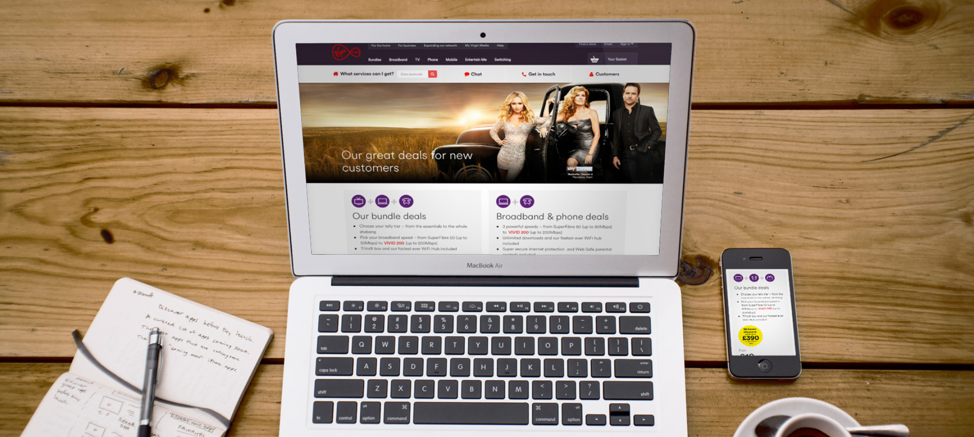
Virgin Media offer page optimisation
Virgin Media offer page optimisation
The offer page is one of the critical pages for Virgin and has a high volume of traffic. The discovery phase has indicated that the users' engagement was low, and they didn't understand the content, so there is a huge opportunity to optimise this page.
Optimising this page by using analytics, online tools, and user testing was a crucial part of the process. The AB testing for this new version showed a 5.7% conversion rate uplift.
To comply with my non-disclosure agreement, I have omitted and obfuscated confidential information in this case study. All information in this case study is my own and does not necessarily reflect the views of Virgin Media.
Research
Analytics
Online tools
Old design
The page below is the design before the optimisation.

New design
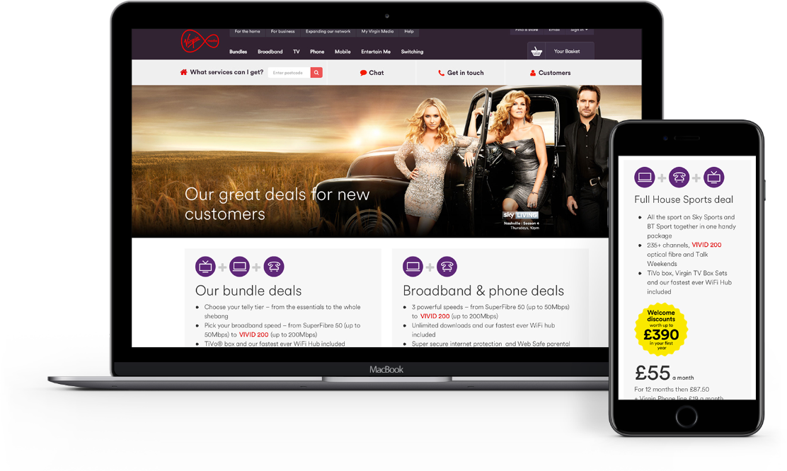
The page below is the final design after the optimisation.

Process
The creative process began with setting objectives, looking at the analytics, and discovering the users' key drivers and purchase behaviour.
I redesigned the contents making it more digestible with an easy-to-understand format. I displayed what they are expecting to see, four best offers with the relevant package details and the benefits and incentives.
We validated the designs by user testing, EyeQuant, and AB testing before the newly designed page went live.
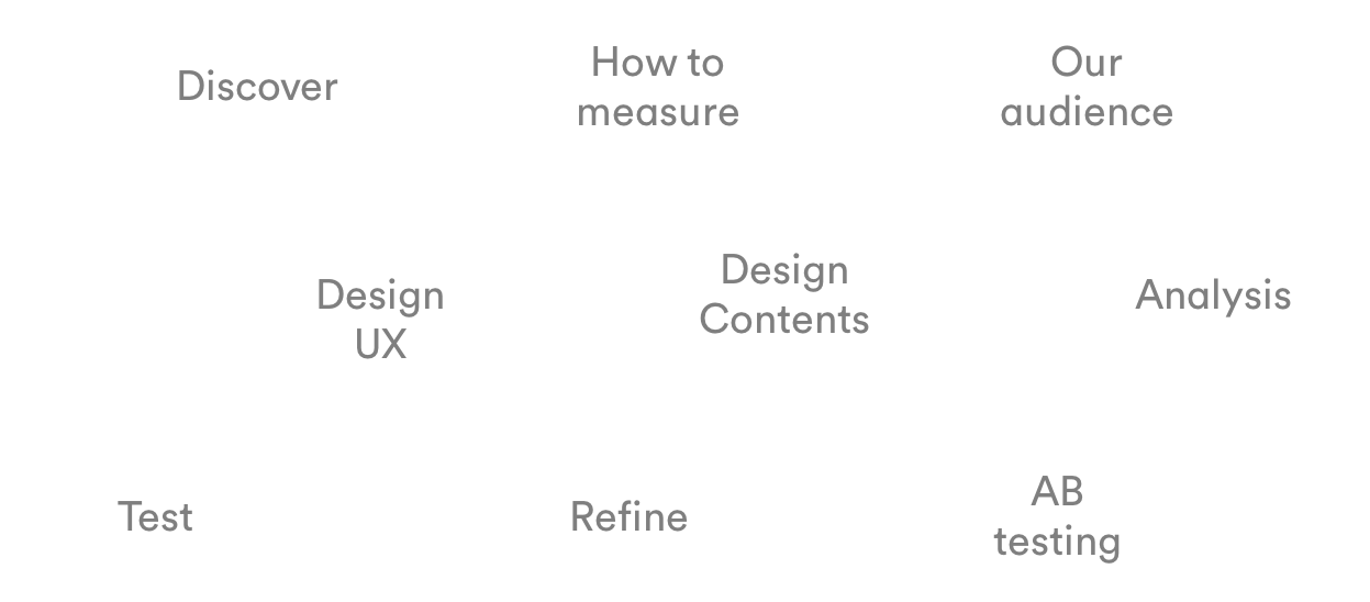

Methods
I used multiple methods to establish customer insights and behaviour and discover what the user is expecting to see.
The methods commonly used in the industry are useful, but they can give some inaccurate assumptions and hypotheses if we use only one of them independently.
Applying multiple methods at the same time gives us a more accurate view of what is happening and why.
ClickTale
EyeQuant
Usertesting.com
Digital personas
Journey tracker
Audience research
Page analysis
Competitor research

ClickTale Analysis
ClickTale enables us to analyse consumer behaviour, needs and intent by using four heatmaps - Mouse Move, Mouse Click/Tap, Attention and Scroll-Reach/Exposure.
I have discovered and established some hypotheses about the page:
1) People are scrolling: Average scroll depth is 3195px
Hypothesis: The info underneath the uSwitch section might not be relevant.
2) Clicks on global navigation is higher than the in-page clicks
Hypotheses:
• The users are unable to find what they are looking for, so they are navigating to another page
• The top bundle offer is not engaging enough
3) The clicks on the top offer is 10.2%. The clicks on the rest of the CTA buttons are very few
Hypothesis: The offers are not attractive enough

EyeQuant Analysis
EyeQuant is The world's fastest AI-based design audit tool.
EyeQuant provides the analyses on how users will look at your websites, landing pages and newsletters within the first few seconds of their visit.
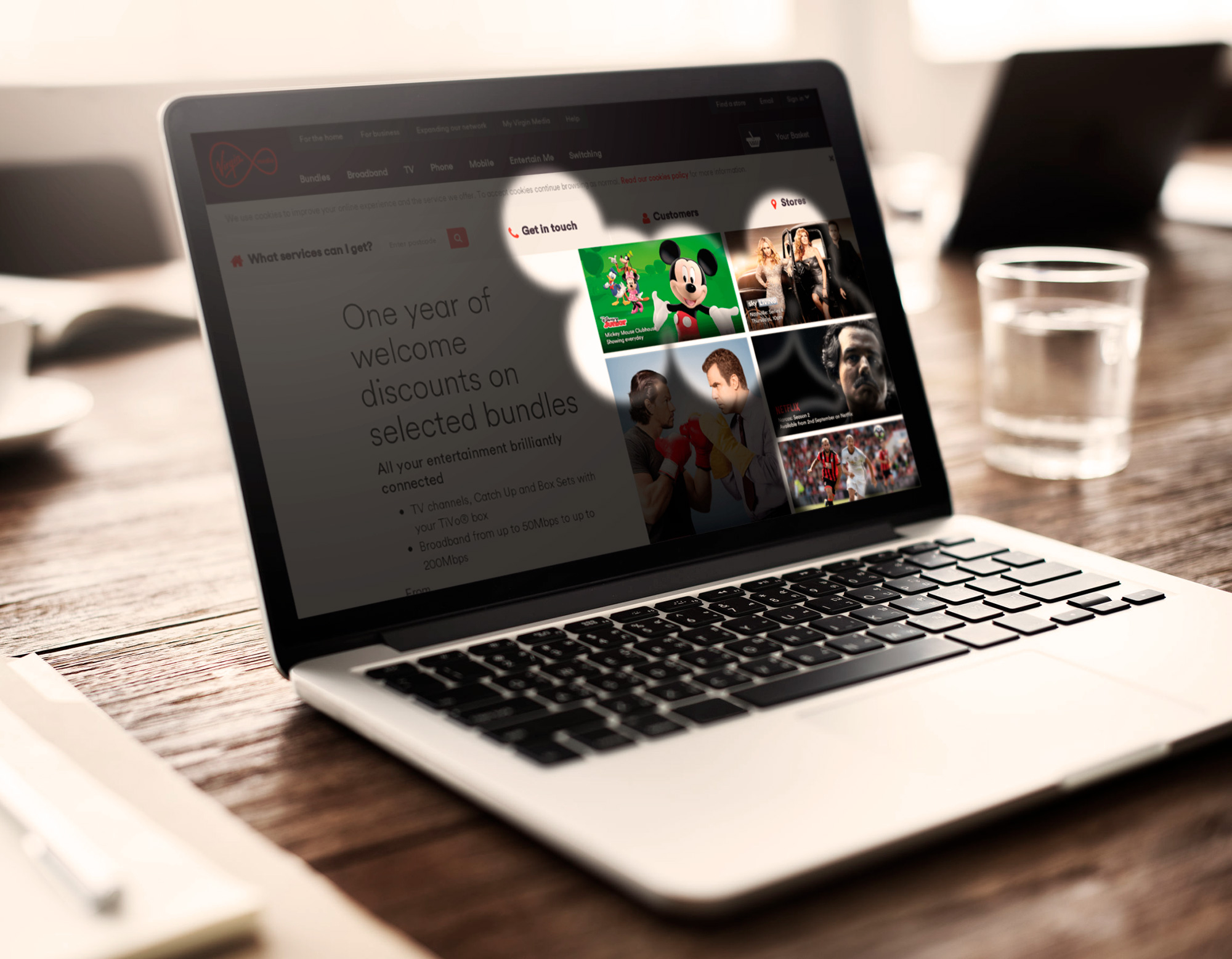
Perception Map (New Visitor)
The Perception Map illuminates the content that the user will see in the first few seconds of landing on a web page.
As shown in the image on your left, the users will focus on imagery, rather than the package detail or CTA button. Therefore, the main offer of each package and a CTA button must visually stand out to improve usability and increase sales completed per new visitor.
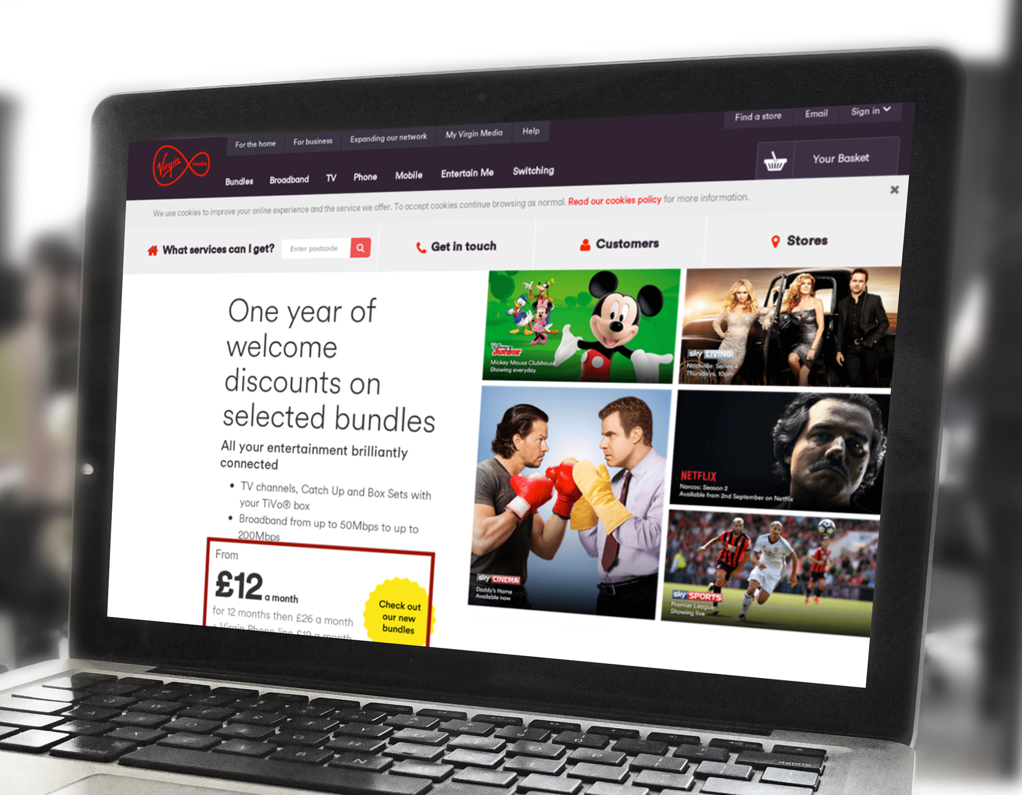
Visibility of New Region
The visibility of the New Region enables you to mark up elements on your screenshot. The value indicates how much more (or less) visible an area is compared to the screenshot's average.
As you can see in the picture, the main CTA button is not visible, and the visibility of the pricing region is -14%.
User Testing
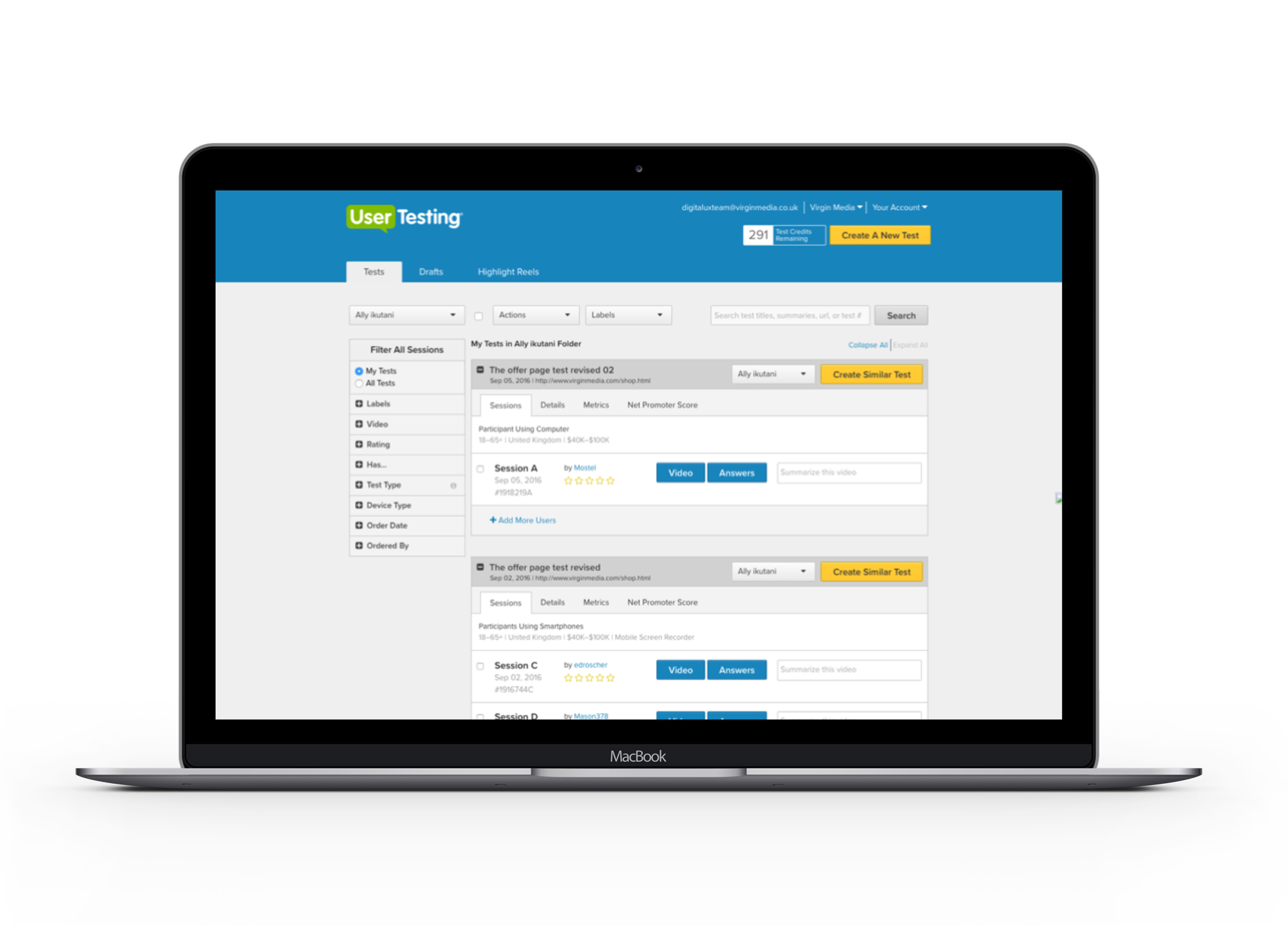
UserTesting.com is an online platform that can test any website or mobile app. The test can be launched at any time of the day and produces results in a few hours.
Below is what I tested:
• Four tests each for desktop and mobile
• What the users are expecting to see
• Qualitative questions about the page
• Test if the hypotheses from ClickTale analysis are true or false
I established the key findings of the existing offer page below:
• The mobile experience was poor
• The users were confused about the offers
• The users needed a very long time to comprehend the contents
• The users trusted our site and product
• The users made suggestions and ideas of offers they want to see

Digital Personas
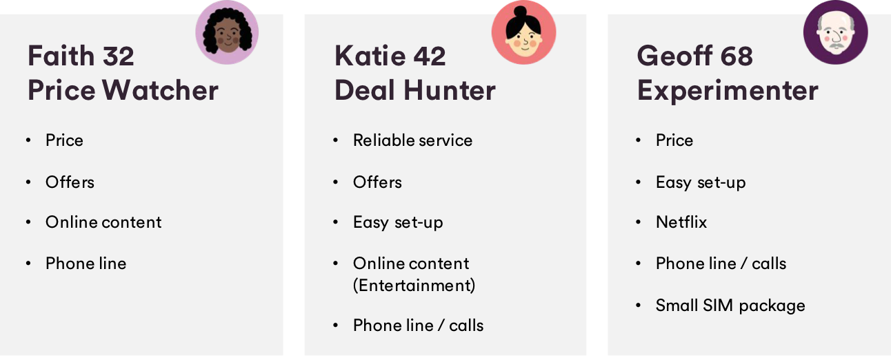
Virgin Media has five different digital personas - Luke, Rob, Faith, Katie, Geoff. Using digital personas enabled me to have a good idea of what the customer is expecting to see on the offer page.
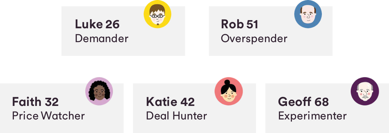
For instance, the characteristics of the Faith, Katie and Geoff (FKG) customers resulted in them being very driven by price and offers as opposed to the Rob and Luke personas. FKG shared very similar attitudes and product needs when choosing a package. Thus, I designed the offer page to appeal to our FKG personas.
Refining: Validating the new design
One of the essential steps in designing is to evaluate the design by taking users' feedback. After going through the hard work of all the analysis and testing, most of us would presume that the design is complete. However, there is always room for further improvement, and it is vital to make sure the new designs work, especially before running A/B testing.
Firstly, I used EyeQuant to make sure that all the critical information and CTA buttons were visible to the users.
Then, I ran another set of user testing to validate the latest design. It resulted in positive user feedback, with a few minor user suggested adjustments.
I incorporated the adjustments into the final design before A/B testing.
The Results
Test duration: 2 weeks
Order uplift: 5.7% very strong
Established new ways of working and convinced the business to put customer needs at the heart of what we do,
© 2012-2025 Five Pencils Limited. All rights reserved.