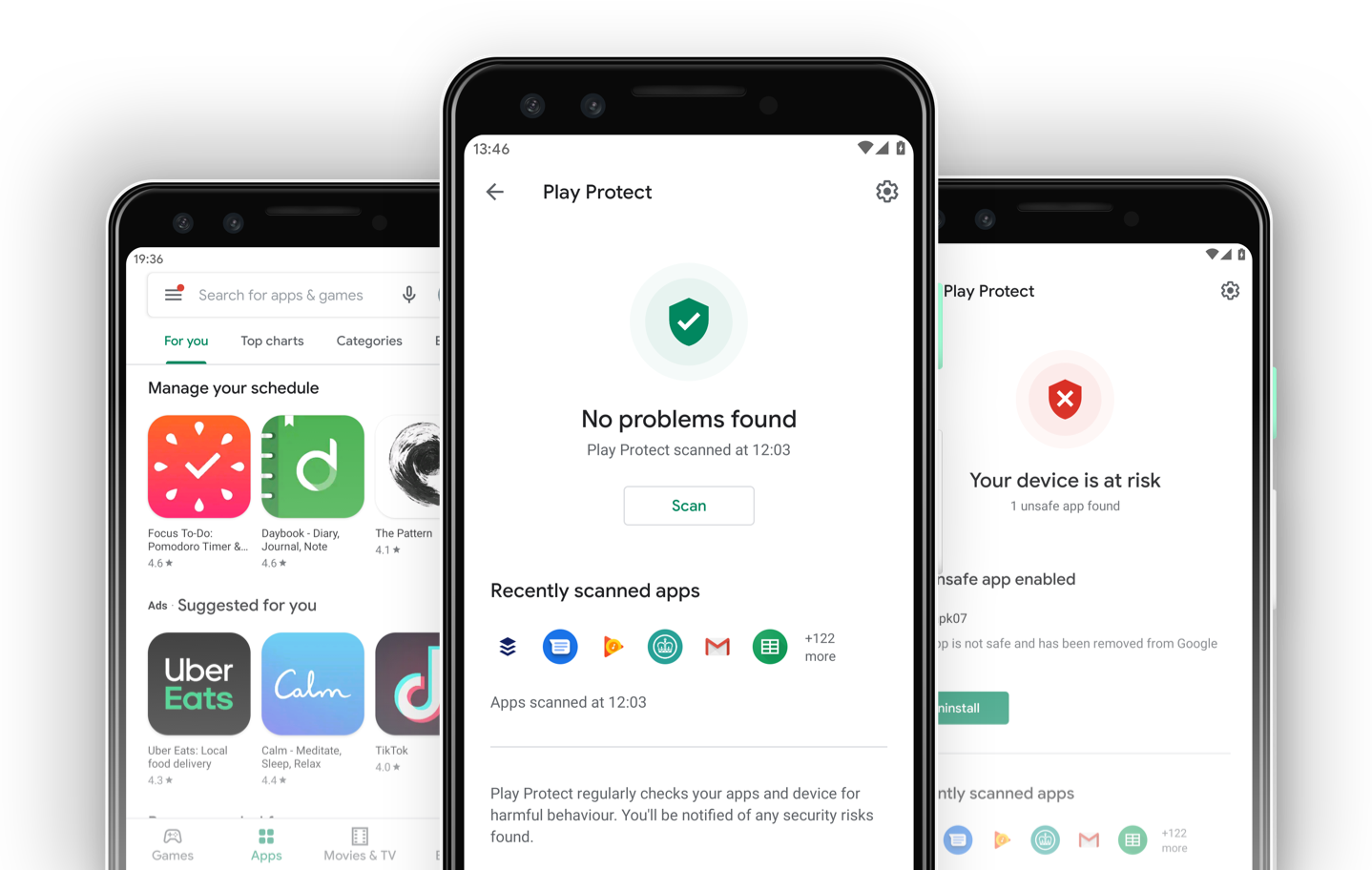
Google Play Protect
Google Play Protect is Google's built-in malware protection across 2.5 billion android devices. Backed by the strength of Google's machine learning algorithms, it is always improving in real-time.
Play Protect helps you keep your device safe and secure, scanning 2 billion devices daily. It warns you about any detected malware apps found and uninstalls them from your device. It also sends you privacy alerts about apps that can access your personal information without the user’s permission.
In 2018, I joined the Play Protect team in London and my role was to keep users safe from any security and privacy threats.
To comply with my non-disclosure agreement, I have omitted and obfuscated confidential information in this case study. All information in this case study is my own and does not necessarily reflect the views of Google.
How to discover Play Protect
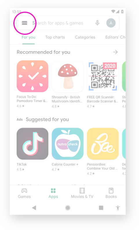
1) Accessing from Play Store
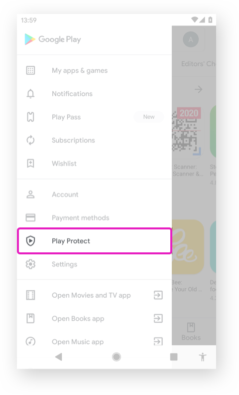
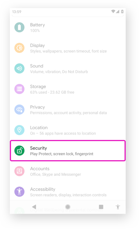
2) Accessing from Settings
The background
Play Protect is part of the Google Play Store. It runs a safety check on apps from the Play Store before you download them. The user can enter Play Protect from the left nav in Play Store or device settings. Since 2018, Play Protect has evolved through 3 visual design updates with Play Store.
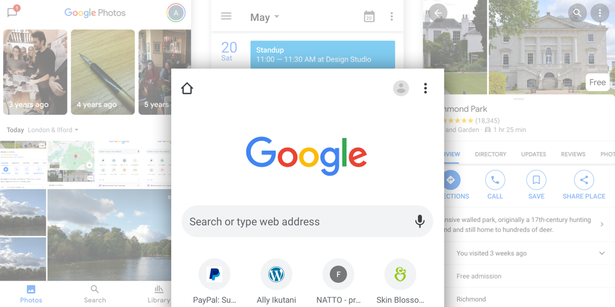
Play Store visual update
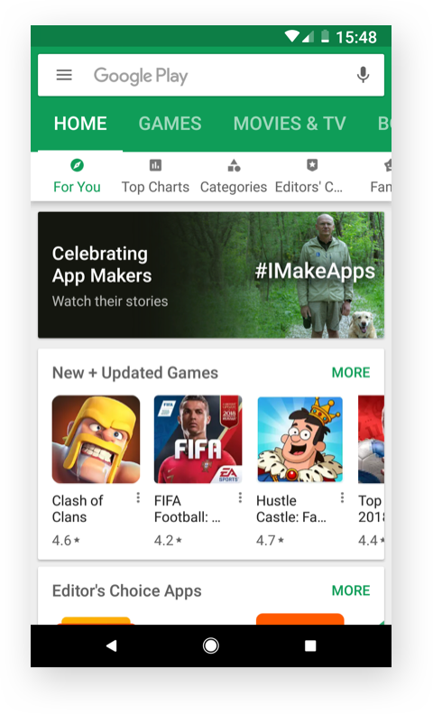
Play Store Material 1.0
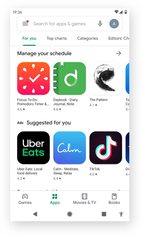
Play Store Material 2.0
Play Protect visual updates
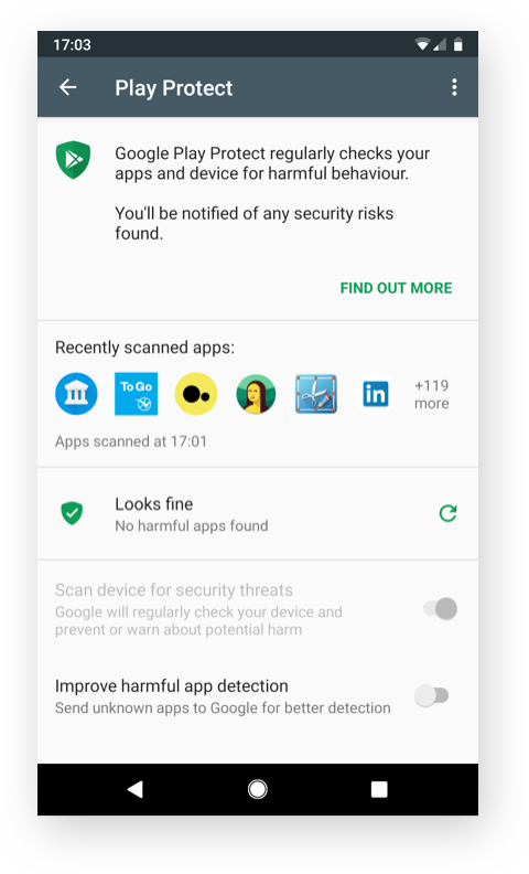
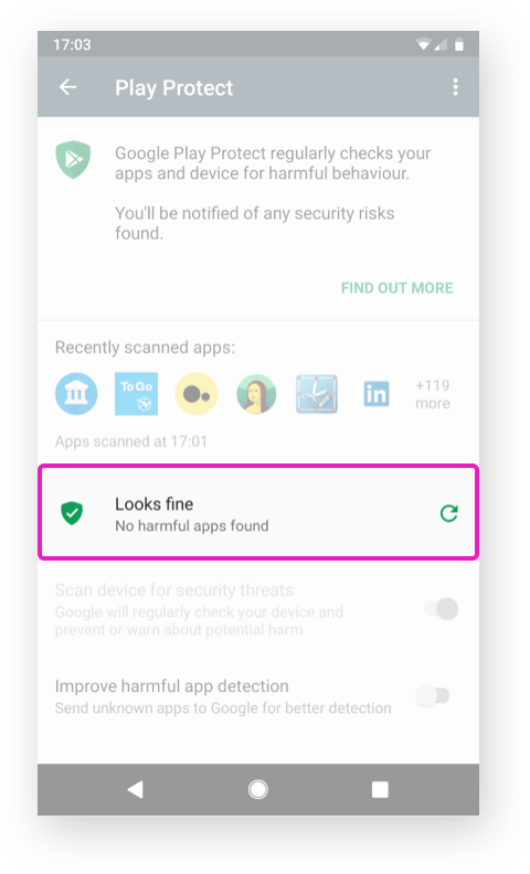
The legacy Play Protect
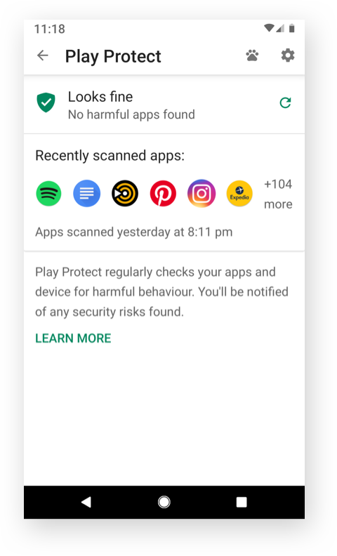
Play Protect Material 1.0
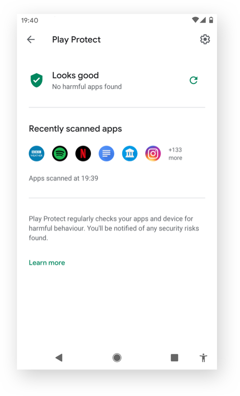
Play Protect Material 2.0
The challenge
The legacy Play Protect home was visually very busy, and it didn't clearly inform the users of any security/privacy threats. Also, the look and feel needed to be aligned with Google Material to enhance the user experience.
We wanted to create an intuitive and beautiful product through the upcoming visual updates whilst ensuring the solution has synergies with Google Material.
Our high-level goals were to:
Inform the security status of the device to users
Enable the users to solve any security threats immediately
Make users feel safe by building a trusting relationship
My role
I managed the visual redesigns with Material 1.0 and 2.0 Material 2.0 collaborating closely with engineers, UX designers, a Researcher and QA testers, and Product Managers in an agile environment.
I was involved from the start of the projects to product launches including understanding the engineering system and Play Store UI components library, designing, prototyping, producing the specs for engineers and testing making sure the designs look great across mobile and tablet devices and Chromebook.
UX
Designers
UX
Researchers
Product
Managers
Engineers
QA testers
1) Informing the security status to users
Bold, graphic, intentional. Material Design is guided by print design methods — typography, grids, space, scale, colour, and imagery — to create hierarchy, meaning, and focus that immerse the viewer in the experience.
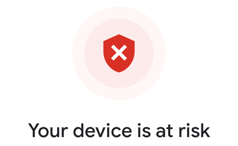
Play Protect scans automatically scans all the apps on the device and warns the user of any problems or potential threads by using the traffic light system:
- Green: Looks fine
- Yellow: Your device may be at risk
- Red: Your device is at risk
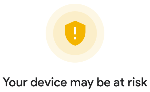
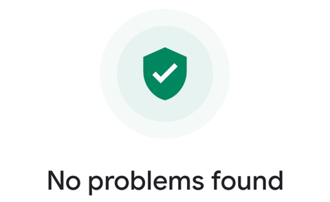
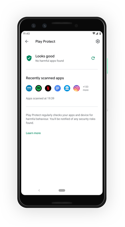
We wanted to create a clear hierarchy around the security status so that the user can check the security status of the device immediately.
We reordered the cards, removed unnecessary visual elements, and relocated the toggles under settings so the user could focus on what is really important on the screen.
In the latest visual update, this security status became even more prominent.
Previously the overall security status of the device wasn't a permanent feature in the Play Protect home screen. For example, when the user has multiple security and privacy issues, the user will only see the warning cards (i.e. the red and yellow warning cards). The user was informed of the severity of each warning by the colour of the icons within the card; however, the user was not able to work out the overall security of the user’s device.
By introducing the permanent central security status of the device, it enabled the users to check the device state at a glance, also giving them an overview of the security summary. It also created a more consistent experience across all Play Protect features - device security in Settings, Google Account, and Play Store.
2) Enabling the users to solve any security threats immediately
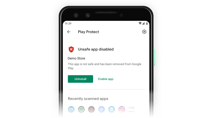
The red warning is the most severe, and it will always be shown above the yellow warnings and green recommendations. For example, when the users have multiple security warnings, the user will see the most dangerous malware issue first. This helps the user to uninstall this malware quickly and exit the “Your device is at risk” state.
Each card is designed with a very prominent primary CTA (Call to Action button) to clearly indicate that “UNINSTALL” is the action we are recommending for the user to take. After the user takes action, they will be notified by a message assuring them that the uninstallation was successful. When all the security threats are resolved, the overall security status of the user’s device will go back to the green “No problems found” status and the user will be assured that the device is safe.
3) Make users feel safe: Being respectful towards the users builds a trusting relationship
When we are talking about security and privacy in cyberspace, "trust" is a critical core emotional driver of user behaviour. It is the key to building a strong relationship with users. It is something that takes time to gain; however, it can be lost very quickly if we do something to upset the users.
So how do we actually create and build "trust" with the users through user experience? - Being respectable plays a big part when it comes down to trustworthiness.
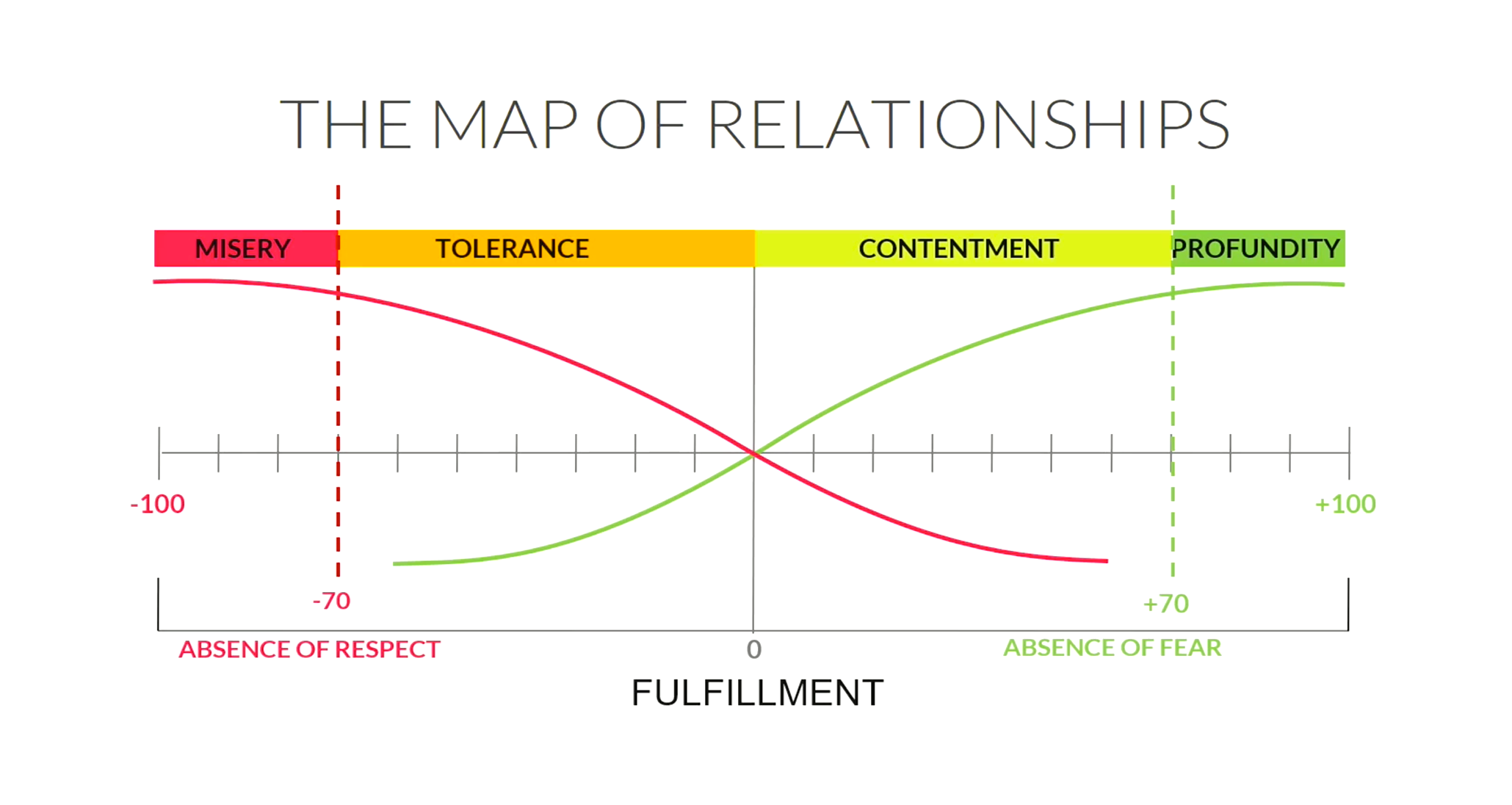
This is the map of relationships created by Rory Kilmartin, a well respected Relationship Researcher and Human Developer based in London.
The red line represents fear, and the green line represents respect. This graph summarises the strong correlation between the absence of respect and people feeling misery. When people were respected, there was an absence of fear, and they felt happy. The same applies to any kind of relationship, including the one with users or customers.
Being respectable is the foundation for building a trusting relationship with the users and making them feel safe. Throughout all the projects I worked on, I respected the user's security and privacy by always giving them options and respecting their choices as well as being transparent. I influenced the engineering team to see designs from a user's point of view and understand the importance of building trust through the design by involving them in the user research and sharing my knowledge.
The Results
The first migration enabled the team to improve the feature release process by 70%. The second design update saved about 75% of engineering time with an automatic responsive layout and dark mode support.
For confidentiality reasons, I have omitted the actual values for these metrics.
© 2012-2025 Five Pencils Limited. All rights reserved.